
Somewhere to Come Back To — cart recovery for flight booking
A cart recovery card for airline booking, built from stage-by-stage drop-off behaviour and the biases behind it — not from persuasion patterns.
Role
Lead designer, end to end
Team
Product, BA, Engineering, Analytics
Scope
iOS · Android · Live Activity
Status
Shipped (Available at Qatar airways app)

Half of abandoned bookings come back on their own. We stopped designing a reason to return, and designed the place to return to.
The problem
People start a flight booking and don't finish it.
That's ordinary in e-commerce, but a flight cart isn't a shopping basket. Fares move. Seats sell. A booking left open for six hours isn't the same booking when someone comes back to it — and the longer it sits, the less of it we can still honour.
So the question wasn't how to chase people. It was what to do with something that's still changing while nobody's watching it.
Why people leave
I looked at drop-off by stage rather than in aggregate, because the reasons weren't the same at each one.
✈️ Flight selection — 35% left because the fare didn't suit their budget and they wanted to search different dates or destinations. 20% were comparing fares with other airlines. 15% weren't planning a trip at all yet.
🧑 Passenger details — 29% fare, 21% still comparing, 13% didn't have passenger details to hand, 10% simply ran out of time.
💳 Payment — 30% found the fare had changed. 19% hit a system error or a long load. 10% wanted to pay with Avios instead.

Where people leave, across the booking flow
Two things stood out
Across the whole funnel, around half of all abandonment was about money. And a large share of the rest wasn't abandonment at all — it was interruption. People who didn't have all passenger details in front of them, or who ran out of time, or who were waiting to hear back from the person they were travelling with.
The second group is the interesting one.
Interruption has a well-documented shape, and three effects describe it. Together they told us the intention was already coming back — and where to meet it.
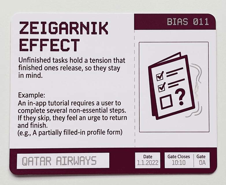
Zeigarnik effect
Unfinished tasks hold a tension that finished ones release, so they stay in mind.
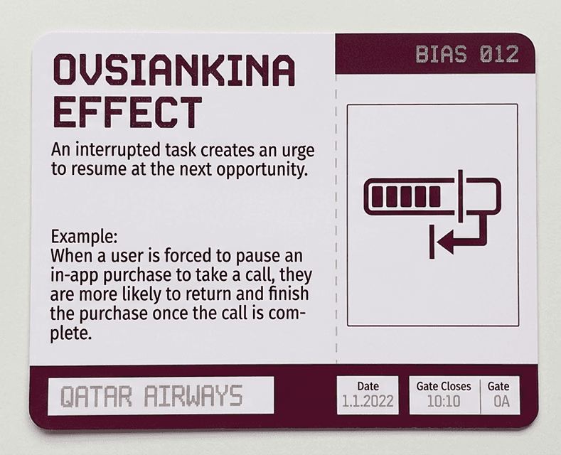
Ovsiankina effect
An interrupted task creates an urge to resume at the next opportunity.
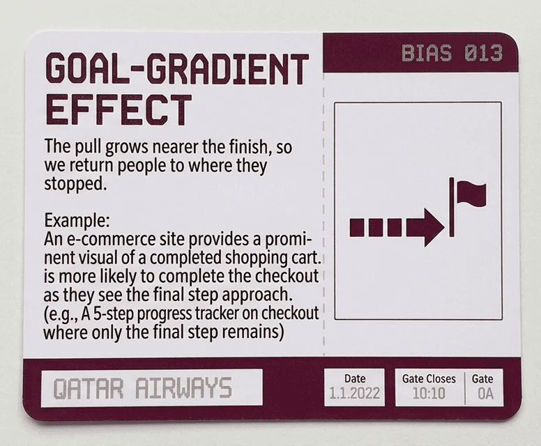
Goal-gradient effect
The pull grows nearer the finish, so we return people to where they stopped.
That is exactly what our data showed. 50.8% of customers came back to a recent search within 24 hours without anyone asking them to. The intention was already there, already returning on its own schedule.
Which changed what we were designing. Not a reason to come back — they had one. Somewhere to come back to.
This research wasn't segmented by membership tier, and the aggregate was dominated by guests and first-time bookers. That shaped what we could claim, and what we had to reason out.

Half of everyone who leaves, leaves over money — and a card can't change a fare. Most of the rest were interrupted rather than unconvinced.
And most come back on their own.
What we decided
Most cart recovery assumes the customer has lost interest and must be re-persuaded. Ours said the opposite: the interest persists, and what decays is the ease of acting on it.
So the question inverted. Not how do we make them want this again but how much can we remove between them and what they already want.
Three principles came out of that. Everything after this point is one of them applied.

Return them to where they stopped, not to the start.
An open loop pulls at people — So the card's action changes with the drop-off point: Select return flight, Fill in passenger details, Confirm & pay. Nobody restarts a search they'd already finished. The loop reopens exactly where it closed.

Say only what we can still prove.
If the card says something that isn't true when someone taps through, they stop believing the next thing it says too.
So we don't show a fare, because fares change. If someone picked a lowest-fare option, the badge says that — it describes their choice, not a price we might not be able to hold. Few seats left only shows within fifteen minutes of the search, because after that we can't be sure it's still true.

Different people are holding different questions
A nudge only works if it answers the question the person is actually carrying. Show a discount to someone worried about a seat and you haven't persuaded them of anything — you've just proved you weren't listening.
The badge is chosen from what we already know about that person and that search: their segment, their tier, the cabin they picked, and the flight option they'd chosen.
That is exactly what our data showed. 50.8% of customers came back to a recent search within 24 hours without anyone asking them to. The intention was already there, already returning on its own schedule.
Which changed what we were designing. Not a reason to come back — they had one. Somewhere to come back to.
This research wasn't segmented by membership tier, and the aggregate was dominated by guests and first-time bookers. That shaped what we could claim, and what we had to reason out.
The card,
decision by decision
✅ What's on it
Route, dates, passengers, one action.
Two airport codes at the largest size on the card, because that's what someone recognises before they've read anything — their own trip, not a generic prompt. Dates and passenger count sit beneath, quiet, confirming rather than announcing.
❌ What isn't on it
No price.
That was the hardest decision and the one I'd defend first. 30% of payment-page abandonment happened because the fare had changed — so quoting a price we might not honour would break trust at exactly the moment we were asking for it back. A customer who taps a number and finds a different one at the other end doesn't come back a second time.
Instead, if someone had already selected a lowest-fare option, the badge reflects the choice they made, not a number we're promising. Same reassurance, no cheque we can't cash.

card variants · badge set · action footer set · the display logic matrix
The badges
Two, never three.
A nudge only works if it answers the question the person is actually carrying. Show a discount to someone worried about a seat and you haven't persuaded them — you've proved you weren't listening. And a third badge doesn't add a third reason; it makes all of them read as marketing, and the customer stops reading any.
So the priority changes by who's looking. A guest sees Lowest fare or Promo code applied. A Silver member sees availability and what they'll earn. A Gold or Platinum member sees Business, Qsuits, First.
The action
One, and it changes with where they stopped.
An abandoned booking is an open loop, and people are pulled back toward open loops — but only while reopening one stays cheap. Every step between the reminder and the resumption is a place that pull dissipates.
So a guest who left while choosing a return flight sees Select return flight. A Gold member who left at payment on a Business fare sees Pay with Cash + Avios. Nobody restarts a search they'd already finished. The badge carries the reason to return; the action carries the return itself.
The full logic
Five drop-off points, three content categories, three tier priorities. Which badge leads, which action appears, which claims are still permitted.
It reads as a spreadsheet because that's what it is — but the idea underneath is simple. Two independent decisions compose one card: who you are picks the badge, where you stopped picks the action.

Content display logic on cart recovery card, based on user segment, flight selections, tier and behavioural nudge.
Dismissing
A card that can't be refused is a card people learn to resent. Around 15% of people who left hadn't made travel plans yet, and some had already booked elsewhere — for them the card is clutter, and no amount of tailoring fixes that.
So the card can be dismissed. One gesture, no confirmation, no reason asked for.
That's the honest version of a dismiss, and it's why the control sits on each search rather than on the section as a whole. Clearing the one trip that's no longer happening leaves every other search the customer had assembled exactly where it was.
That is exactly what our data showed. 50.8% of customers came back to a recent search within 24 hours without anyone asking them to. The intention was already there, already returning on its own schedule.
Which changed what we were designing. Not a reason to come back — they had one. Somewhere to come back to.
This research wasn't segmented by membership tier, and the aggregate was dominated by guests and first-time bookers. That shaped what we could claim, and what we had to reason out.
The full list
Ordering answers two different questions.
Most recent first by default — the last thing you were doing is usually the thing you want. A sort by departure date puts the nearest trip on top, for people holding several plans at once and working to whichever leaves soonest.
Every new search joins it and nothing expires on a timer.
The only automatic removal is the one we can be certain about: a search disappears once its departure date has passed, because that trip can no longer be booked. We never decide on the customer's behalf that a plan has gone cold.
The entry point sits under Recent searches → View all on the home page, and only appears once there are more than three. Below that, the list would repeat what's already on screen.
That is exactly what our data showed. 50.8% of customers came back to a recent search within 24 hours without anyone asking them to. The intention was already there, already returning on its own schedule.
Which changed what we were designing. Not a reason to come back — they had one. Somewhere to come back to.
This research wasn't segmented by membership tier, and the aggregate was dominated by guests and first-time bookers. That shaped what we could claim, and what we had to reason out.
Why a Live Activity
Two numbers decided this. 50.8% of customers return to a recent search within 24 hours unprompted, and up to 72% of those finish within the first three.
So this was never a reminder problem. The intention already exists — it peaks early and fades across a day. What was missing was somewhere for the booking to wait. Not when do we interrupt them, but how long must it stay reachable, on a surface that asks for nothing.

Lock Screen · Dynamic Island compact · Dynamic Island expanded
That is exactly what our data showed. 50.8% of customers came back to a recent search within 24 hours without anyone asking them to. The intention was already there, already returning on its own schedule.
Which changed what we were designing. Not a reason to come back — they had one. Somewhere to come back to.
This research wasn't segmented by membership tier, and the aggregate was dominated by guests and first-time bookers. That shaped what we could claim, and what we had to reason out.
✅ Stayed
The route, promoted to the thing the whole surface is built around: two airport codes, a flight path, the dates beneath each. Two badges. One action.
❌ Went
Passenger count, the dismiss control (the system owns it here), and the step-specific wording: Select return flight and Confirm & pay collapse into Complete my booking. The label generalises — the destination doesn't.
➕ Added
a countdown on the fare hold: how long the selected fare stays honoured before it has to be re-priced.

Outcome
Shipped on iOS and Android, with the Live Activity on iOS, and still live.
Our internal measurement for this work was commercial, and I'm not able to share those figures. What I can say is that the pattern was retained and extended across the booking flow after launch.
What the data supported: in the six months after launch, an average of 62% of users who abandoned a booking returned through the card within 24 hours, up from 50.8% before the redesign.
It made returning easier. It didn't make the trip more affordable — and those are different results.
Live app experience: the user starts a booking, leaves partway through the flow, and returns to where they left off.
What I learnt, and what I'd evolve
Understanding the behaviour told us to do less, not more.
The instinct in this category is to add persuasion. Reading the behaviour properly pointed the other way: the intention was already returning on its own, so our job was to take steps out of its path rather than push harder against it. The single most effective element wasn't a nudge at all — it was the action changing to match where the person stopped.
Behavioural design gets talked about as a way to move people. Most of the time it's a way to stop getting in their way.
Averages hide the people you most want to keep.
Half of all abandonment looked like price. Designing to that number would have produced one card that spoke to guests and said nothing useful to anyone loyal. Setting the priority by tier rather than by average is the decision I'd defend hardest — and the one I'd most want to validate properly.
Nudges have to be provable at the moment they're read.
Availability claims decay, so we time-limited them. Fares move, so we stopped quoting them. A nudge that can't back itself up is spent the first time someone taps through and finds it wasn't true.
Not every abandoned booking is a problem.
Around 15% of people who left hadn't made travel plans yet. There's nothing to persuade them of, so the card doesn't try — it holds what they'd put together, so it's still there when the plan becomes real. Some abandonment is just early.
Know which numbers are outcomes and which are symptoms.
Nearly a fifth of payment drop-off came from system errors and slow loads. The card catches some of that — people retry later and the booking is still there. But it doesn't fix it. That's the booking team's problem, and a recovery rate that quietly absorbs a reliability issue makes the issue harder to see.
What I'd do next
Match the badge to the reason rather than the segment: someone who left over price should see price, someone who left at payment should see reassurance. Get segmented drop-off data and test the tier hypothesis directly. And treat the Live Activity as a surface that earns a second look, not a shrunken card.